Enhanced Controls
WPF Suite has property extensions for most controls, including state properties, corner rounding, and some controls have functionality extensions.
State Properties
You will see in the enhanced control, some additional properties, such as HoverBackground, HoverBorderBrush, which, as the name suggests, indicate the value of the corresponding property in the corresponding state.
If these properties are set to null, they will also fallback correctly to the set Background and BorderBrush property values.
This means that you don’t need to change the template to set the control to look a certain way in a certain state.
Example
<ws:Button Content="TextButton"
           Padding="4"
           BorderBrush="Transparent"
           Background="Transparent"
           HoverBorderBrush="#33000000"
           HoverBackground="#EEFFFFFF"
           PressedBackground="#c8f8ff"/>
Appearence, non-hovering, hovering and pressed states:


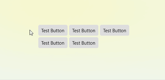
Transition Effects
In the WPF Suite, all controls, by default, have transition effects accompanying property changes during state transitions. For example, if there is a container with several Buttons like the following:
<ws:Button Padding="8 6"
           Content="Test Button"
           BorderThickness="0"
           CornerRadius="4"
           HoverBackground="#94d1ff"
           PressedBackground="#4895cf"
           PressedForeground="White">
</ws:Button>
The effect is as follows:
Easing Functions and Transition Duration
Each state of a control can be configured with easing functions and transition durations, and each property of each state can also be individually configured with easing functions and transition durations.
For example, to set the transition duration for all properties in the Hover state, you only need to set the HoverTransitionDuration property. If you want to set the transition duration specifically for the Background property in the Hover state, you can set the HoverBackgroundTransitionDuration property.
If no transition duration is set, it will fall back in the following order: current state, current property's transition duration, current state's transition duration, default transition duration. The same applies to easing functions.
However, it’s important to note that the easing function and transition duration refer to those used when transitioning from another state to the current state. For example, the “Pressed” state generally requires a quick response, so you can set PressedTransitionDuration to 0:0:0, meaning no animation is applied, and the properties are immediately applied.
Most controls have transition durations set for the Default, Hover, and Pressed states. For controls that do not have a Pressed state, similar states like the Dragging state for Thumb also have transition durations set.
Property Fallback Mechanism
When a control’s state changes and properties need to be switched, there is a fallback mechanism to determine the target property value. For example, by default, if the PressedBackground of a button is null, it will attempt to use HoverBackground. If HoverBackground is also null, it will fall back to the Background property.
To set the fallback state for a specific state, use the “State{StateName}Fallback” attached property. For example, to modify the fallback state for Pressed state properties to Default, set “StatePressedFallback” to Default.
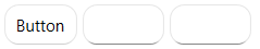
Rounding Corners
Button, TextBox, PasswordBox and most controls now support CornerRadius for rounding corners.
Example
<ws:StackPanel Orientation="Horizontal"
               Spacing="4">
    <ws:Button Content="Button"
               CornerRadius="10"/>
    <ws:TextBox MinWidth="60"
                CornerRadius="10"/>
    <ws:PasswordBox MinWidth="60"
                    CornerRadius="10"/>
</ws:StackPanel>
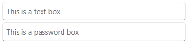
Placeholder
TextBox and PasswordBox can now set placeholders via the Placeholder property. The placeholder is displayed when the textbox is empty.
Example
<ws:StackPanel Spacing="4">
    <ws:TextBox Placeholder="This is a text box"/>
    <ws:PasswordBox Placeholder="This is a password box"/>
</ws:StackPanel>
Rounding Corners Clipping
Set ClipToBounds of Border to true to clip off the parts that exceed the range of Border.
Example:
<ws:Border ClipToBounds="True"
           CornerRadius="40 30 20 10"
           Width="200">
    <Image Source="/Assets/TestImage2.jpg"/>
</ws:Border>

However, if Border has a border, its content will still cover the border part:

At this time, we can use BorderContentAdapter to help clip off the parts that exceed the inner edge of the border:
<ws:Border ClipToBounds="True"
           CornerRadius="40 30 20 10"
           BorderBrush="Firebrick"
           BorderThickness="5"
           Width="200">
    <ws:BorderContentAdapter>
        <Image Source="/Assets/TestImage2.jpg"/>
    </ws:BorderContentAdapter>
</ws:Border>

Or by binding the Clip of the content to the ContentClip property of Border, the parts that exceed the inner edge of the border can also be automatically clipped. The effect is exactly the same.
<ws:Border ClipToBounds="True"
           CornerRadius="40 30 20 10"
           BorderBrush="Firebrick"
           BorderThickness="5"
           Width="200">
    <Image Source="/Assets/TestImage2.jpg"
           Clip="{Binding RelativeSource={RelativeSource AncestorType=ws:Border},Path=ContentClip}"/>
</ws:Border>
BorderContentAdaptercan be used not only in theBorderof EleCho.WpfSuite but also in the built-inBorderof WPF. In both cases, the content can be correctly clipped.
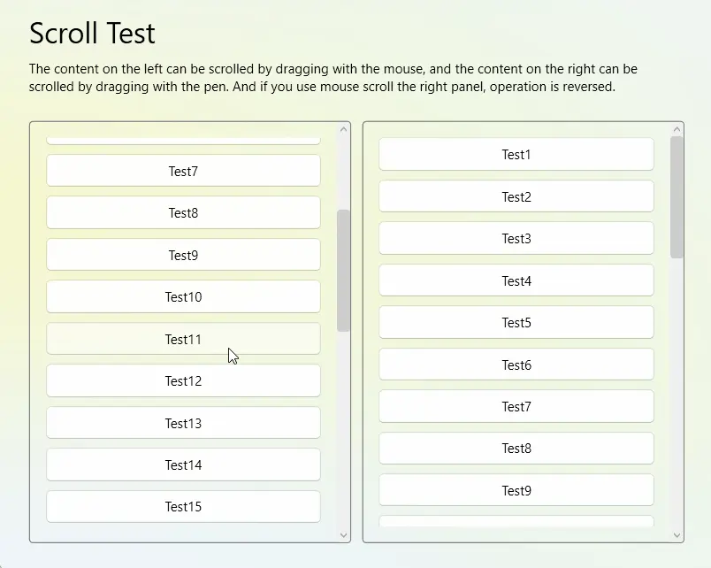
Smooth Scrolling
If you use the ScrollViewer provided by the WPF Suite, it will have a smoother effect on content scrolling with the mouse.
| Property | Type | Description |
|---|---|---|
| ScrollWithWheelDelta | bool | Determines the scroll distance by the delta value of Wheel event. This option is used to optimize the scroll effect. The default value is true |
| EnableScrollingAnimation | bool | Enable scrolling animation, which determines whether to use easing when scrolling with the mouse. The default value is true and this option requires ScrollWithWheelDelta to be set to true. Otherwise it doesn’t work |
| ScrollingAnimationDuration | Duration | The duration of scrolling animation, the default value is 250 ms |
| MouseScrollDeltaFactor | double | When scrolling with the mouse, the multiplier of the scrolling Delta value. Change this value to change the scroll speed and direction. The default is 1 |
| TouchpadScrollDeltaFactor | double | When scrolling with the touchpad, the multiplier of the scrolling Delta value. Change this value to change the scroll speed and direction. The default is 1 |
| AlwaysHandleMouseWheelScrolling | bool | Always handle the mouse Wheel event for scrolling, ScrollViewer content is scrolled when the mouse wheel scrolls. The default is true |
Will AlwaysHandleMouseWheelScrolling set to false, the ScrollViewer smooth scrolling effect will not be applied in TextBox
Example:
<ws:ScrollViewer>
    Some content...
</ws:ScrollViewer>
Touch Simulation
Native WPF does not support scrolling with a stylus on a ScrollViewer. However, if you want to enable scrolling with a stylus, you can use “touch device simulation”. By simulating a touch device with the stylus, you can achieve scrolling functionality using the stylus.
| AttachedProperty | Type | Description |
|---|---|---|
| StylusTouchDevice.Simulate | bool | Whether to simulate the pen as a touch device, default is false |
| StylusTouchDevice.MoveThreshold | double | Move threshold, the pen will report as touch move only after moving beyond the specified distance, default is 3 |
| MouseTouchDevice.Simulate | bool | Whether to simulate the mouse as a touch device, default is false |
| MouseTouchDevice.MoveThreshold | double | Move threshold, the mouse will report as touch move only after moving beyond the specified distance, default is 3 |
If you set the move threshold to 0, you will not be able to click on controls inside the ScrollViewer using the pen, because the pen always has some jitter and touch move will trigger the scrolling of the ScrollViewer, interrupting the click action.
So, adjust the move threshold according to your desired “precision”. (Many programs have a larger threshold for this, such as 5px, or even 10px or more)
Example:
<ws:ScrollViewer PanningMode="Both"
                 ws:MouseTouchDevice.Simulate="True">
    SomeContent...
</ws:ScrollViewer>