增强控件
WPF Suite 对于大部分控件都有进行属性拓展, 包括状态属性, 圆角设置, 部分控件还进行了功能拓展
状态属性
你会在增强的控件中, 多了一些属性, 例如 HoverBackground, HoverBorderBrush, 正如其名, 它们表示在对应状态下对应属性的值.
如果对这些属性设置了 null, 也会正确的 fallback 到设定的 Background 和 BorderBrush 属性值.
也就是说, 你不需要更改模板, 就可以直接设定控件在某状态下的某种样式.
使用示例
<ws:Button Content="TextButton"
           Padding="4"
           BorderBrush="Transparent"
           Background="Transparent"
           HoverBorderBrush="#33000000"
           HoverBackground="#EEFFFFFF"
           PressedBackground="#c8f8ff"/>
效果, 非悬停状态, 悬停状态以及按下状态:


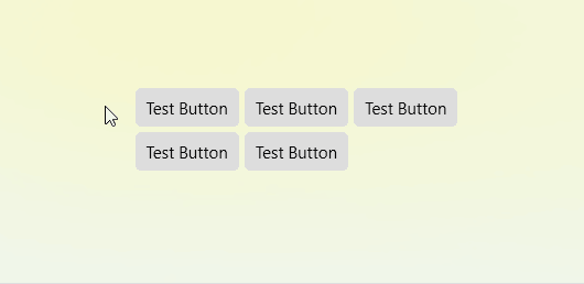
过渡效果
WPF Suite 中的所有控件, 在默认情况下, 状态切换伴随的属性变更, 都有过渡效果. 假如有一个容器有若干个如下 Button:
<ws:Button Padding="8 6"
           Content="Test Button"
           BorderThickness="0"
           CornerRadius="4"
           HoverBackground="#94d1ff"
           PressedBackground="#4895cf"
           PressedForeground="White">
</ws:Button>
其效果如下:
缓动函数与过渡时间
控件的每一个状态都可以配置缓动函数以及过渡时间, 每一个状态的属性也都可以单独配置缓动函数以及过渡时间.
例如, 要设置 Hover 状态下所有属性的过渡时间, 只需要设定 HoverTransitionDuration 属性即可. 若是想为 Hover 状态下 Background 单独设置过渡时间, 也只需要设定 HoverBackgroundTransitionDuration 属性即可.
如果没有设置缓动时间, 会按照 当前状态, 当前属性的缓动时间, 当前状态的缓动时间, 默认缓动时间 这样的顺序进行回退(Fallback). 缓动函数同理.
不过, 需要注意的是, 缓动函数以及过渡时间, 指的是从其他状态过渡到当前状态所使用的缓动函数以及过渡时间. 例如, “按下” 状态一般需要快速的响应, 所以可以设定 PressedTransitionDuration 为 0:0:0, 即不做任何动画, 立即应用属性.
大部分控件都设置了 Default, Hover 以及 Pressed 状态下的过渡时间. 对于没有 Pressed 状态的控件, 也设置了和 Pressed 状态类似状态的过渡时间. 例如 Thumb 的是 Dragging 状态.
属性回退机制
在控件状态变化的时候, 要切换属性时, 取得目标属性值时有回退(Fallback)机制. 例如默认情况下, 如果当前按钮的 PressedBackground 为 null, 那么会尝试使用 HoverBackground, 如若 HoverBackground 也为 null, 那么会继续回退到 Background 属性.
如果要设置某一状态的回退状态, 使用 “State状态名Fallback” 附加属性即可. 例如, 要修改 Pressed 状态属性的回退状态为 Default, 设置 “StatePressedFallback” 为 Default 即可.
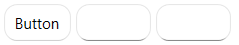
圆角
现在 Button, TextBox, PasswordBox 以及绝大部分控件都支持使用 CornerRadius 来设置圆角. 同时圆角也支持过渡效果.
使用示例
<ws:StackPanel Orientation="Horizontal"
               Spacing="4">
    <ws:Button Content="Button"
               CornerRadius="10"/>
    <ws:TextBox MinWidth="60"
                CornerRadius="10"/>
    <ws:PasswordBox MinWidth="60"
                    CornerRadius="10"/>
</ws:StackPanel>
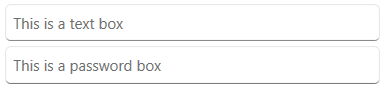
占位符
TextBox 和 PasswordBox 现在可以通过 Placeholder 属性来设置占位符. 占位符会在文本框为空的时候显示.
使用示例
<ws:StackPanel Spacing="4">
    <ws:TextBox Placeholder="This is a text box"/>
    <ws:PasswordBox Placeholder="This is a password box"/>
</ws:StackPanel>
圆角裁剪
将 Border 的 ClipToBounds 设为 true, 即可裁剪掉超出 Border 范围的部分.
使用实例:
<ws:Border ClipToBounds="True"
           CornerRadius="40 30 20 10"
           Width="200">
    <Image Source="/Assets/TestImage2.jpg"/>
</ws:Border>

但如果 Border 带有边框, 其内容仍然会遮盖住边框部分:

此时, 我们可以借助 BorderContentAdapter 来帮助裁剪超出边框内边缘的部分:
<ws:Border ClipToBounds="True"
           CornerRadius="40 30 20 10"
           BorderBrush="Firebrick"
           BorderThickness="5"
           Width="200">
    <ws:BorderContentAdapter>
        <Image Source="/Assets/TestImage2.jpg"/>
    </ws:BorderContentAdapter>
</ws:Border>

或者通过绑定内容的 Clip 到 Border 的 ContentClip 属性, 也可以自动裁剪超出边框内边缘的部分. 效果是完全一致的.
<ws:Border ClipToBounds="True"
           CornerRadius="40 30 20 10"
           BorderBrush="Firebrick"
           BorderThickness="5"
           Width="200">
    <Image Source="/Assets/TestImage2.jpg"
           Clip="{Binding RelativeSource={RelativeSource AncestorType=ws:Border},Path=ContentClip}"/>
</ws:Border>
BorderContentAdapter不仅可以在 EleCho.WpfSuite 的Border中使用, 也可以在 WPF 内置的Border中使用, 都可以将内容正确裁剪调.
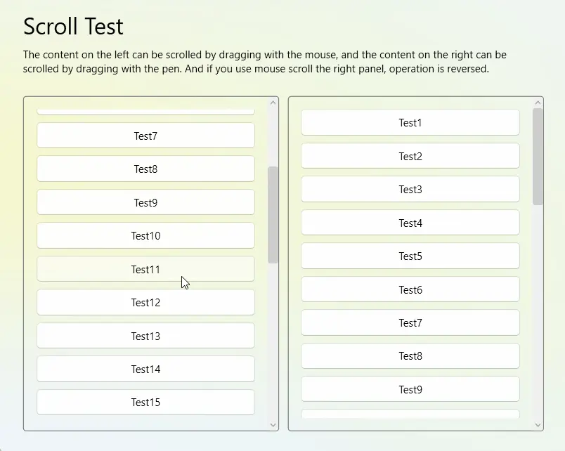
平滑滚动
如果你使用 WPF Suite 提供的 ScrollViewer, 那么对于使用鼠标的内容滚动, 会有更平滑的效果.
| 附加属性 | 类型 | 描述 |
|---|---|---|
| ScrollWithWheelDelta | bool | 通过 Wheel 事件的 delta 值决定滚动距离, 此选项用于优化滚动效果, 默认为 true |
| EnableScrollingAnimation | bool | 启用滚动动画, 决定使用鼠标进行滚动时是否使用缓动的效果, 默认为 true, 并且此选项要求 ScrollWithWheelDelta 设为 true, 否则不起作用 |
| ScrollingAnimationDuration | Duration | 滚动动画的时长, 默认为 250ms |
| MouseScrollDeltaFactor | double | 当使用鼠标进行滚动时, 滚动 Delta 值的乘数. 改变此值可以变更滚动速度与方向, 默认为 1 |
| TouchpadScrollDeltaFactor | double | 当使用触摸板进行滚动时, 滚动 Delta 值的乘数. 改变此值可以变更滚动速度与方向, 默认为 1 |
| AlwaysHandleMouseWheelScrolling | bool | 总是处理鼠标 Wheel 事件的滚动, 当鼠标滚轮滚动时则滚动 ScrollViewer 内容. 默认为 true |
将 AlwaysHandleMouseWheelScrolling 设置为 false 时, ScrollViewer 的平滑滚动效果将不会应用于 TextBox 上
使用示例:
<ws:ScrollViewer>
    省略内容...
</ws:ScrollViewer>
触摸模拟
原生的 WPF 是无法使用笔对 ScrollViewer 进行滚动的, 如果你想要通过笔来滚动, 可以使用 “触摸设备模拟”. 通过笔来模拟一个触摸设备, 实现笔滚动.
| 附加属性 | 类型 | 描述 |
|---|---|---|
| StylusTouchDevice.Simulate | bool | 是否将笔模拟为触摸设备, 默认为 false |
| StylusTouchDevice.MoveThreshold | double | 移动阈值, 笔在移动超过指定的距离之后, 才会将移动汇报为触摸移动, 默认为 3 |
| MouseTouchDevice.Simulate | bool | 是否将鼠标模拟为触摸设备, 默认为 false |
| MouseTouchDevice.MoveThreshold | double | 移动阈值, 笔在移动超过指定的距离之后, 才会将移动汇报为触摸移动, 默认为 3 |
如果你将移动阈值设为 0, 那么你将无法通过笔来进行点击 ScrollViewer 内的控件, 因为笔总是存在抖动的, 触摸移动会进行 ScrollViewer 的滚动, 从而打断点击这一动作.
所以, 根据你想要的 “精度”, 适当调整 “移动阈值”. (很多程序对于这个都有一个较大的阈值, 例如 5px, 甚至 10px 或更多)
使用示例:
<ws:ScrollViewer PanningMode="Both"
                 ws:MouseTouchDevice.Simulate="True">
    省略内容...
</ws:ScrollViewer>