Layout Panels
Layout panels in the WPF Suite that have the same name as the original WPF panels are used in the same way. The use of the two expanded Layout Panels is also more intuitive.
The following are instructions for using the Layout panel in the WPF Suite
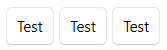
StackPanel
Stacking panel, arranges child elements in a vertical or horizontal row.
| Property | Type | Description |
|---|---|---|
| Orientaion | Orientation | The layout direction of the element, defaults to vertical. |
| Spacing | double | The spacing between the elements in the panel, default is 0. |
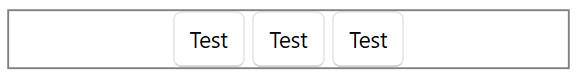
Example
<ws:StackPanel Orientation="Horizontal" Spacing="4">
    <ws:Button Content="Test"/>
    <ws:Button Content="Test"/>
    <ws:Button Content="Test"/>
</ws:StackPanel>
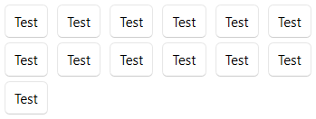
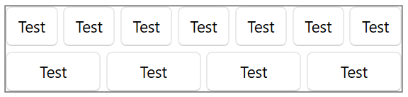
WrapPanel
Row break panel, arranges child elements in a horizontal or vertical row in the specified direction, and automatically breaks lines beyond the edges of the panel.
| Property | Type | Description |
|---|---|---|
| Orientation | Orientation | The layout direction of the element, defaults to vertical. |
| ItemWidth | double | The width of the element, if the value is NaN, then it is auto-width, default is NaN |
| ItemHeight | double | The height of the element, if the value is NaN, then it is auto-height, default is NaN |
| HorizontalSpacing | double | The horizontal spacing between the elements in the panel, default is 0. |
| VerticalSpacing | double | The vertical spacing between the elements in the panel, default is 0. |
Example
<ws:WrapPanel Orientation="Horizontal"
              HorizontalSpacing="8"
              VerticalSpacing="4">
    <ws:Button Content="Test"/>
    <ws:Button Content="Test"/>
    <ws:Button Content="Test"/>
    <ws:Button Content="Test"/>
    <ws:Button Content="Test"/>
    <ws:Button Content="Test"/>
    <ws:Button Content="Test"/>
    <ws:Button Content="Test"/>
    <ws:Button Content="Test"/>
    <ws:Button Content="Test"/>
    <ws:Button Content="Test"/>
    <ws:Button Content="Test"/>
    <ws:Button Content="Test"/>
</ws:WrapPanel>
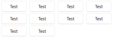
UniformGrid
Provides a method of arranging content in a grid (where all cells are the same size).
| Property | Type | Description |
|---|---|---|
| Columns | int | Number of columns in the grid, defaults to 0, i.e. adaptive |
| Rows | int | The number of rows in the grid, defaults to 0, i.e. adaptive. |
| FirstColumn | int | The number of empty cells at the beginning of the first row of the grid, default is 0 |
| HorizontalSpacing | double | The horizontal spacing between the elements in the panel, default is 0. |
| VerticalSpacing | double | The vertical spacing between the elements in the panel, default is 0. |
Example
<ws:UniformGrid HorizontalSpacing="8"
                VerticalSpacing="4">
    <ws:Button Content="Test"/>
    <ws:Button Content="Test"/>
    <ws:Button Content="Test"/>
    <ws:Button Content="Test"/>
    <ws:Button Content="Test"/>
    <ws:Button Content="Test"/>
    <ws:Button Content="Test"/>
    <ws:Button Content="Test"/>
    <ws:Button Content="Test"/>
    <ws:Button Content="Test"/>
</ws:UniformGrid>
RelativePanel
Enables elements to be laid out relative to the position of the panel or other elements.
Attached properties
| Property | Type | Description |
|---|---|---|
| AlignLeftWithPanel | bool | Whether to align the left side with the panel. |
| AlignTopWithPanel | bool | Whether to align the top with the panel. |
| AlignRightWithPanel | bool | Whether to align the right side with the panel. |
| AlignBottomWithPanel | bool | Whether to align the bottom with the panel. |
| AlignLeftWith | UIElement | The target element to align the left side with. |
| AlignTopWith | UIElement | The target element to align the top with. |
| AlignRightWith | UIElement | The target element to align the right side with. |
| AlignBottomWith | UIElement | The target element to align the bottom with. |
| LeftOf | UIElement | Which element to place the current element to the left of (the right side of this element is aligned with the left side of the target element). |
| Above | UIElement | Which element to place the current element above (the bottom of this element is aligned with the top of the target element). |
| RightOf | UIElement | Which element to place the current element to the right of (the left side of this element is aligned with the right side of the target element). |
| Below | UIElement | Which element to place the current element below (the top of this element is aligned with the bottom of the target element). |
Using the above attached properties to determine the horizontal and vertical positions of an element allows for alignment and layout. If two directions of a single dimension are specified simultaneously, such as left and right, then the element will be stretched according to the specified requirements.
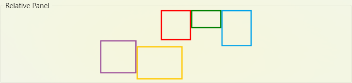
Example
<ws:RelativePanel VerticalAlignment="Center"
                  HorizontalAlignment="Center">
    <Border x:Name="firstBD"
            ws:RelativePanel.AlignHorizontalCenterWithPanel="True"
            BorderBrush="Red"
            BorderThickness="2"
            Width="50"
            Height="50"/>
    <Border x:Name="secondBD"
            ws:RelativePanel.RightOf="firstBD"
            BorderBrush="Green"
            BorderThickness="2"
            Width="50"
            Height="30"/>
    <Border x:Name="thirdBD" ws:RelativePanel.RightOf="secondBD"
            BorderBrush="#00a2ea"
            BorderThickness="2"
            Width="50"
            Height="60"/>
    <Border x:Name="forthBD"
            ws:RelativePanel.Below="firstBD"
            BorderBrush="#9c4e9a"
            BorderThickness="2"
            Width="60"
            Height="55"/>
    <Border ws:RelativePanel.RightOf="forthBD"
            ws:RelativePanel.Below="thirdBD"
            BorderBrush="#ffca0a"
            BorderThickness="2"
            Width="76"
            Height="55"/>
</ws:RelativePanel>
FlexPanel
Flexible panels, which can be thought of as an enhanced WrapPanel, allow you to specify the spatial distribution and alignment of elements.
To understand an elastic panel, it is necessary to know that there are two directions in an elastic panel, the “major axis” and the “cross axis” (or “side axis”). When setting the panel in the direction of the row, i.e. horizontally, the major axis is the horizontal direction and the cross axis is the other direction, i.e. vertically. When setting the panel direction to row, i.e. horizontal, the major axis is the horizontal direction and the cross axis is the other direction, i.e. vertical.
About flex layout, See: Basic concepts of flexbox - CSS Cascading Style Sheets, MDN
| Property | Type | Description |
|---|---|---|
| Direction | FlexDirection | Layout direction, defaults to row, i.e. horizontal. |
| Wrap | FlexWrap | Wrap behavior, defaults to no wrap. |
| MainAlignment | FlexMainAlignment | The alignment of the element on the main axis, default is to the beginning. |
| CrossAlignment | FlexCrossAlignment | The way the content is aligned on the cross-axis, the default is stretched. |
| ItemsAlignment | FlexItemsAlignment | The alignment of the element itself, stretched by default. |
| UniformGrow | double | Uniform grow factor |
| UniformShrink | double | Uniform shrink factor |
| MainSpacing | double | Item spacing on main axis |
| CrossSpacing | double | Item spacing on cross axis |
Attached properties
| Property | Type | Description |
| Order | int | The order of item, default is ‘0’ |
| Grow | double | Grow factor of item self |
| Shrink | double | Shrink factor of item self |
| Basis | double | The initial size of item on main axis |
FlexDirection Definition
| Value | Description |
|---|---|
| Row | Layout on rows, i.e. horizontally |
| RowReversed | Layout on rows, but the order of items within a row is reversed. |
| Column | Layout on columns, i.e. vertically |
| ColumnReversed | Layout on columns, but the order of items in a row is reversed. |
FlexWrap Definition
| Value | Description |
|---|---|
| NoWrap | No wrap |
| Wrap | Wrap |
| WrapReverse | Wrap, but the order of the lines is reversed. |
FlexMainAlignment Definition
| Value | Description |
|---|---|
| Start | Aligning items to the beginning of a line |
| End | Aligning items to the end of a line |
| Center | Aligning items to the center of a line |
| SpaceBetween | Align items to the both sides of a line |
| SpaceAround | Align items around a line, with spacing on both sides of the line. |
| SpaceEvenly | Align items around a line, with same spacing on both sides of each item. |
FlexCrossAlignment Definition
| Value | Description |
|---|---|
| Start | Align lines to the start |
| End | Align lines to the end |
| Center | Align lines to the center |
| Stretch | Stretch line size to fill the container |
| SpaceBetween | Align lines to the both sides of the container |
| SpaceAround | Align lines around the container, with spacing on both sides of the container. |
| SpaceEvenly | Align items around the container, with same spacing on both sides of each line. |
FlexItemsAlignment Definition
| Value | Description |
|---|---|
| Start | Align item to the start |
| End | Align item to the end |
| Center | Align item to the center |
| Baseline | Align item to baseline (This value has no effect) |
| Stretch | Stretch the size of item to fill the item area |
Example, align items to the center
<Border BorderThickness="1"
        BorderBrush="Gray">
    <ws:FlexPanel MainAlignment="Center"
                  MainSpacing="4">
        <ws:Button Content="Test"/>
        <ws:Button Content="Test"/>
        <ws:Button Content="Test"/>
    </ws:FlexPanel>
</Border>
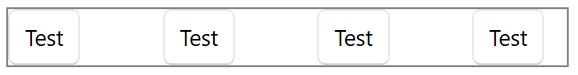
Example, align items to both sides of line
<Border BorderThickness="1"
        BorderBrush="Gray">
    <ws:FlexPanel MainAlignment="SpaceBetween"
                  MainSpacing="4">
        <ws:Button Content="Test"/>
        <ws:Button Content="Test"/>
        <ws:Button Content="Test"/>
        <ws:Button Content="Test"/>
    </ws:FlexPanel>
</Border>
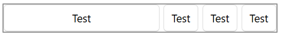
Example, align items to both sides of line, and make the first item fill the remaining space
<Border BorderThickness="1"
        BorderBrush="Gray">
    <ws:FlexPanel MainAlignment="SpaceBetween"
                  MainSpacing="4">
        <ws:Button ws:FlexPanel.Grow="1" Content="Test"/>
        <ws:Button Content="Test"/>
        <ws:Button Content="Test"/>
        <ws:Button Content="Test"/>
    </ws:FlexPanel>
</Border>
Example, wrap, and make each item take up as much of the remaining space as possible
<Border BorderThickness="1"
        BorderBrush="Gray">
    <ws:FlexPanel MainAlignment="SpaceBetween"
                  MainSpacing="4"
                  CrossSpacing="4"
                  UniformGrow="1"
                  Wrap="Wrap">
        <ws:Button Content="Test"/>
        <ws:Button Content="Test"/>
        <ws:Button Content="Test"/>
        <ws:Button Content="Test"/>
        <ws:Button Content="Test"/>
        <ws:Button Content="Test"/>
        <ws:Button Content="Test"/>
        <ws:Button Content="Test"/>
        <ws:Button Content="Test"/>
        <ws:Button Content="Test"/>
        <ws:Button Content="Test"/>
    </ws:FlexPanel>
</Border>
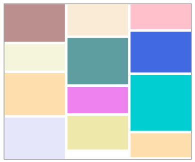
MasonryPanel
Masonry panel, simple waterfall layout implementation.
| Property | Type | Description |
|---|---|---|
| Orientation | Orientation | Layout direction, i.e. the direction in which the elements are stacked, defaults to vertical. |
| Flows | int | number of flows, default is 1, when value is 1, behavior is same as StackPanel |
| FlowSpacing | the distance between flows, defaults to 0 | |
| ItemSpacing | The spacing between items, default is 0. |
Example
<Border BorderThickness="1"
        BorderBrush="Gray">
    <ws:MasonryPanel Flows="3"
                     FlowSpacing="4"
                     ItemSpacing="4">
        <Border Background="RosyBrown" Height="60"/>
        <Border Background="AntiqueWhite" Height="50"/>
        <Border Background="Pink" Height="40"/>
        <Border Background="RoyalBlue" Height="65"/>
        <Border Background="CadetBlue" Height="74"/>
        <Border Background="Beige" Height="42"/>
        <Border Background="NavajoWhite" Height="67"/>
        <Border Background="DarkTurquoise" Height="89"/>
        <Border Background="Violet" Height="42"/>
        <Border Background="PaleGoldenrod" Height="54"/>
        <Border Background="Lavender" Height="66"/>
        <Border Background="NavajoWhite" Height="38"/>
    </ws:MasonryPanel>
</Border>
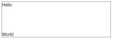
BoxPanel
Box panel, where each item occupies the space of the entire container.
This panel is often used to replace the Grid, and if you only want multiple items to overlap in the same space, using a BoxPanel can improve performance a little.
Example
<Border BorderThickness="1"
        BorderBrush="Gray"
        Height="100">
    <ws:BoxPanel>
        <TextBlock Text="Hello" VerticalAlignment="Top"/>
        <TextBlock Text="World" VerticalAlignment="Bottom"/>
    </ws:BoxPanel>
</Border>