Transition Effects
Implement a transition effect when the content switches, such as fade-in and fade-out, or slide-in and slide-out. It will greatly enhance the aesthetics of the program.
Below is an introduction to the transition animations in WPF Suite.
IContentTransition
An interface that represents a content transition effect.
Definition
/// <summary>
/// Content transition
/// </summary>
public interface IContentTransition
{
    /// <summary>
    /// Run the content transition
    /// </summary>
    /// <param name="container">Container UIElement</param>
    /// <param name="oldContent">Old content UIElement</param>
    /// <param name="newContent">New content UIElement</param>
    /// <param name="forward">This transition is forward</param>
    /// <param name="cancellationToken">Cancellation token</param>
    /// <returns></returns>
    public Task Run(
        FrameworkElement container,
        FrameworkElement? oldContent,
        FrameworkElement? newContent,
        bool forward,
        CancellationToken cancellationToken);
}
Below are some built-in transition effects:
| Class Name | Description |
|---|---|
| FadeTransition | Fade in/out effect achieved by animating the Opacity property. |
| SlideTransition | Slide transition effect achieved by setting the RenderTransform to TranslateTransform and animating its properties. |
| RotateTransition | Rotation transition effect achieved by setting the RenderTransform to RotateTransform and animating its properties. |
| SlideFadeTransition | Combination of fade in/out and slide transition effects. |
| RotateFadeTransition | Combination of fade in/out and rotation transition effects. |
TransitioningContentControl
The ContentControl implementation that allows the use of transition animations inherits from Control.
| Property | Type | Description |
|---|---|---|
| Content | object | The content to display, default is null. |
| ContentTemplate | DataTemplate | The template for the content, default is null. |
| ContentTemplateSelector | DataTemplateSelector | The selector for the content template, default is null. |
| Transition | IContentTransition | The transition effect used for content switching, default is null. |
| CornerRadius | CornerRadius | The radius value for rounded corners. |
TransitioningContentControl does not inherit from ContentControl.
Example
<ws:Button Click="Button_Click"
           ClipToBounds="True">
    <ws:TransitioningContentControl Name="buttonContentControl"
                                    Content="Test">
        <ws:TransitioningContentControl.Transition>
            <ws:SlideFadeTransition Orientation="Vertical"/>
        </ws:TransitioningContentControl.Transition>
    </ws:TransitioningContentControl>
</ws:Button>
private void Button_Click(object sender, RoutedEventArgs e)
{
    buttonContentControl.Content = System.IO.Path.GetRandomFileName();
}

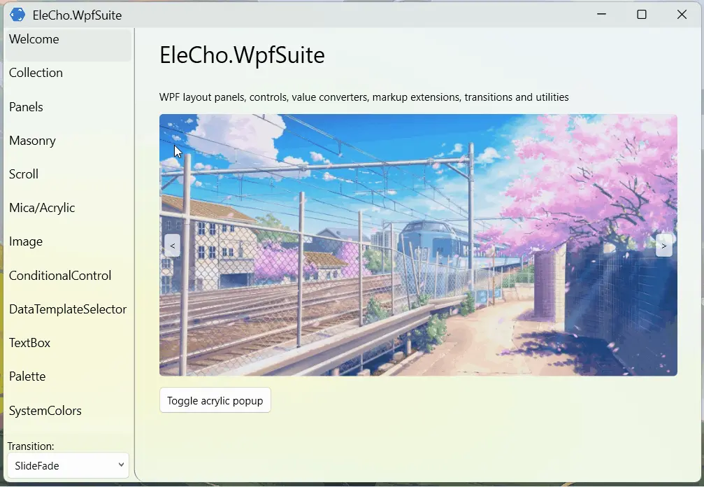
More advanced usage
<Grid>
<ws:TransitioningContentControl Content="{Binding CurrentImageSource}"
d:Content="{d:DesignInstance Type=ImageSource}"
CornerRadius="5"
ClipToBounds="True">
<ws:TransitioningContentControl.Transition>
<ws:SlideTransition Reverse="{Binding TransitionReverse}"/>
</ws:TransitioningContentControl.Transition>
<ws:TransitioningContentControl.ContentTemplate>
<DataTemplate>
<Image Height="300"
Source="{Binding}"
Stretch="UniformToFill"/>
</DataTemplate>
</ws:TransitioningContentControl.ContentTemplate>
</ws:TransitioningContentControl>
<ws:Button Command="{Binding GoPrevCommand}"
VerticalAlignment="Center"
HorizontalAlignment="Left"
Opacity=".8"
Content="<"
Margin="5"
Padding="5">
</ws:Button>
<ws:Button Command="{Binding GoNextCommand}"
VerticalAlignment="Center"
HorizontalAlignment="Right"
Opacity=".8"
Content=">"
Margin="5"
Padding="5"/>
</Grid>
[ObservableProperty]
[NotifyPropertyChangedFor(nameof(CurrentImageSource))]
private int _currentImageSourceIndex;

[ObservableProperty]
private bool _transitionReverse;

public ObservableCollection<ImageSource> ImageSources { get; } = new()
{
    new BitmapImage(new Uri("pack://application:,,,/WpfTest;component/Assets/Banners/1.jpg")),
    new BitmapImage(new Uri("pack://application:,,,/WpfTest;component/Assets/Banners/2.jpg")),
    new BitmapImage(new Uri("pack://application:,,,/WpfTest;component/Assets/Banners/3.jpg")),
    new BitmapImage(new Uri("pack://application:,,,/WpfTest;component/Assets/Banners/4.jpg")),
    new BitmapImage(new Uri("pack://application:,,,/WpfTest;component/Assets/Banners/5.jpg")),
};

public ImageSource? CurrentImageSource => ImageSources[CurrentImageSourceIndex];

public WelcomePage()
{
    InitializeComponent();

    DataContext = this;
}

[RelayCommand]
public void GoPrev()
{
    TransitionReverse = true;
    var prevIndex = CurrentImageSourceIndex;
    if (prevIndex == 0)
        prevIndex = ImageSources.Count;

    prevIndex--;

    CurrentImageSourceIndex = prevIndex;
}

[RelayCommand]
public void GoNext()
{
    TransitionReverse = false;
    CurrentImageSourceIndex = (CurrentImageSourceIndex + 1) % ImageSources.Count;
}
The ObservableProperty and RelayCommand used here are generated using the CommunityToolkit.Mvvm to automatically create observable properties and commands.

Frame
The Frame control provided in WPF Suite also supports navigation transition effects. Therefore, when your program is a multipage program, you can use transition effects to make it more visually appealing.
| Property | Type | Description |
|---|---|---|
| CornerRadius | CornerRadius | The radius of the rounded corners |
| Transition | IContentTransition | The transition effect for content switching |
Overall effect